NotePal.ca is an Ontario curriculum-based education platform from grades 1-8 where teachers can buy and sell quality lessons, assessments, and other educational resources. Parents can also purchase resources to supplement their child's learning. With this big vision NotePal needed a learning marketplace platform that serves multiple type of users. These users fall under two main categories buyers, and sellers.
My role in this project was a combination of a product manager and a design lead. I performed discovery to understand user needs, set the roadmap and strategy, stakeholder management, and oversaw the development process. I started by understanding the client vision, and what they are aspiring for this platform to be.
Building personas and understanding the needs of the users is essential. I began by interviewing and running workshops with sellers and buyers to understand their motivations and goals. Throughout this process, we identified 4 main personas that the platform needs to serve.
In developing a user flow, we mapped each step a user will take to complete goals like purchases or sign-ups, from entry points to final actions. This process emphasizes creating clear, intuitive pathways that minimize friction, guiding users smoothly while meeting business goals. Through collaboration, user research, and testing, we refine each flow through iteration to ensure a seamless, effective user experience.
Considering the complexity of a marketplace, creating a service blueprint is essential to mapping out each stage of the user journey, including front-end interactions, back-end processes, and supporting systems. This detailed outline helped us visualize how users interact with the website and identify dependencies, ensuring seamless service delivery. By developing a clear service blueprint, we aligned internal processes with user needs, optimized workflows, and improved the overall user experience.
Developing a clear and seamless Information Architecture (IA) for the marketplace is key to create a great user experience for both sellers and buyers. This complex IA required iterating with users and running workshops such as card sorting and tree testing to ensure content organization and structure are logical and user-friendly .
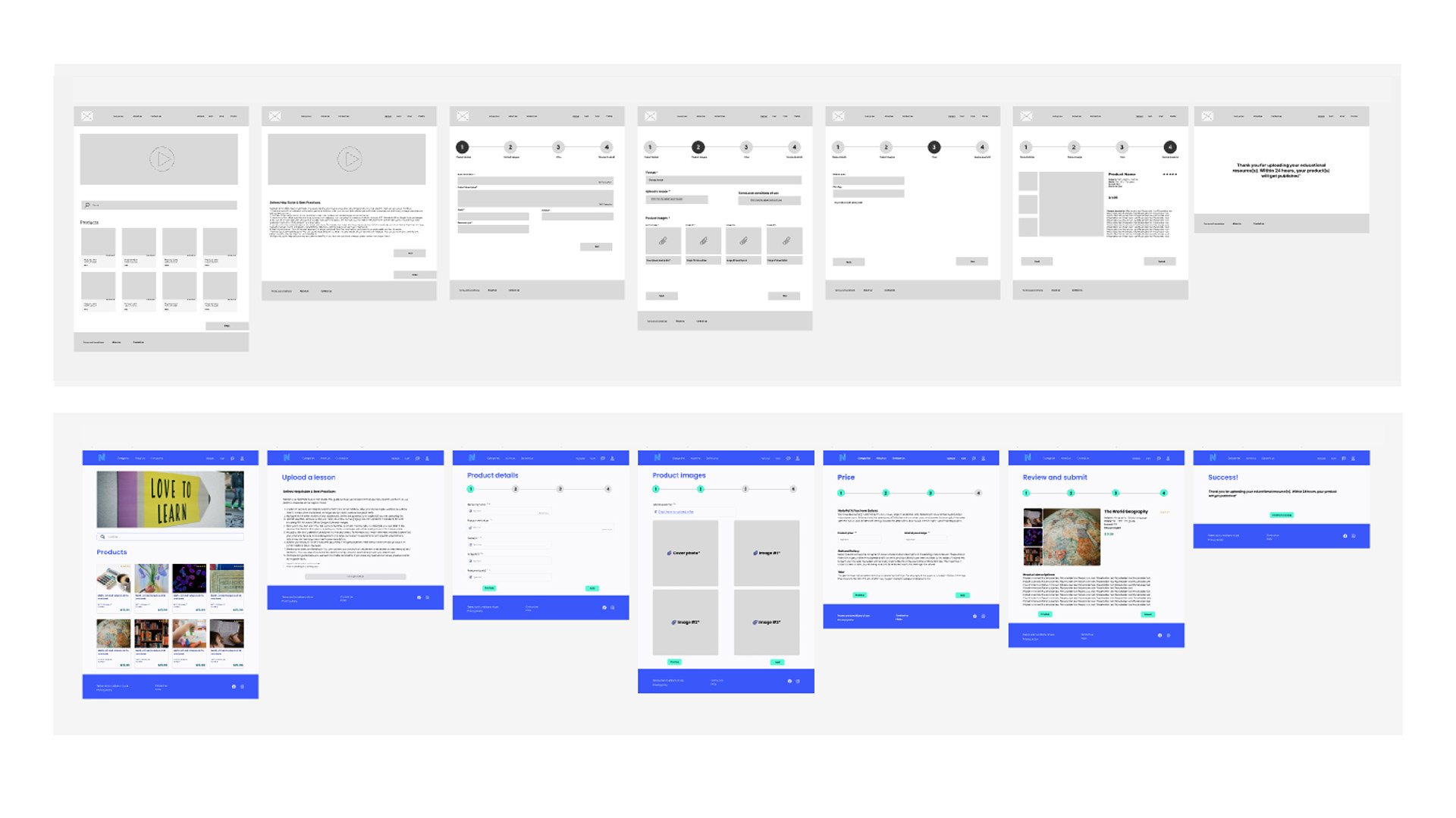
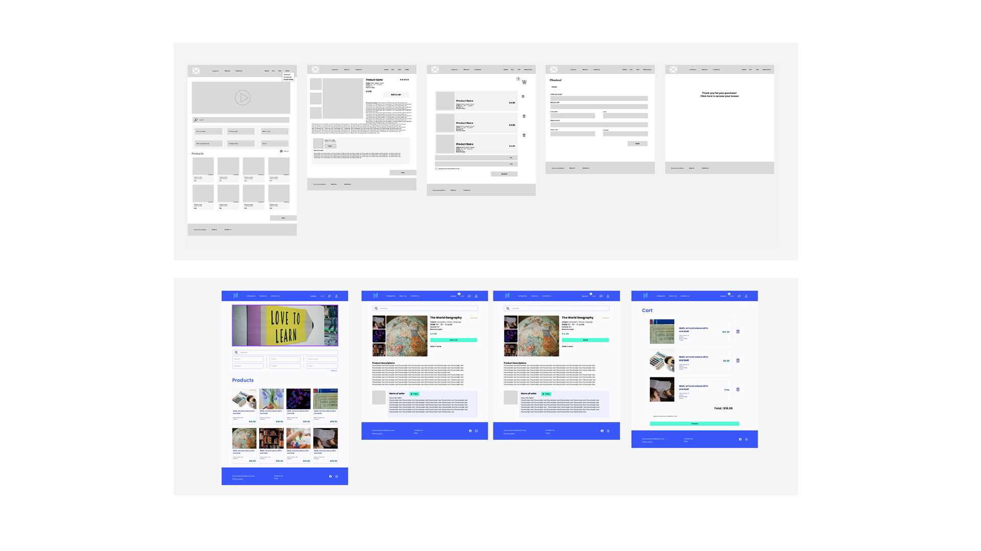
Once a strong foundation for the marketplace was established, I then started to create both low-fidelity (Lo-Fi), mid-fidelity (Mid-Fi), and high-fidelity (Hi-Fi) prototypes to refine the user experience and visual design. As I was progressing through every level of fidelity, I was running tests with users to identify ares of improvements, catch errors, and iterate early and frequently. This progression helped us validate design decisions, gather user feedback, and ensure the end product meet aesthetic and functional requirements.
