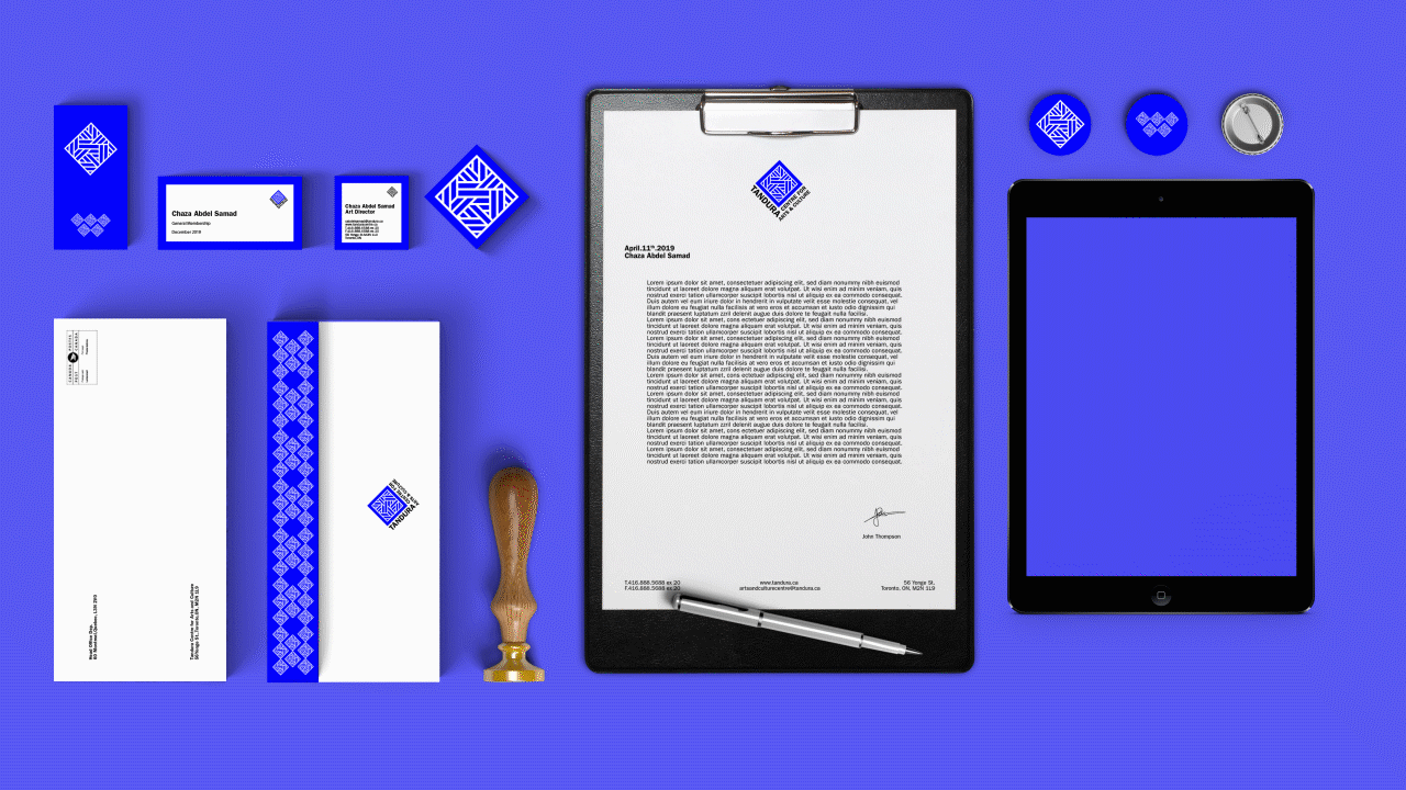
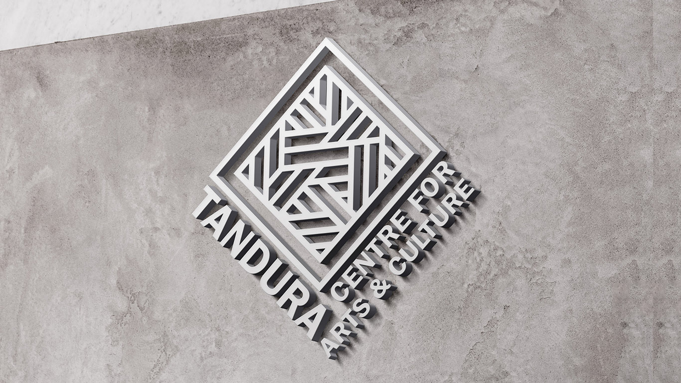
Tandura, an Arts and Culture Centre, is divided into 5 departments to give its visitors an access to a world of endless creativity. This endless creativity is what inspired its identity design. The connectivity of the different types of arts presented across the Centre inspired the intricate design of the pattern.
The power of colour-coding
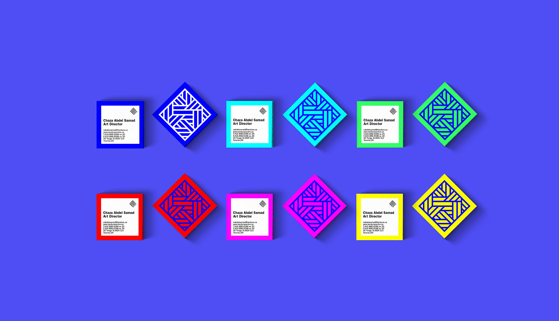
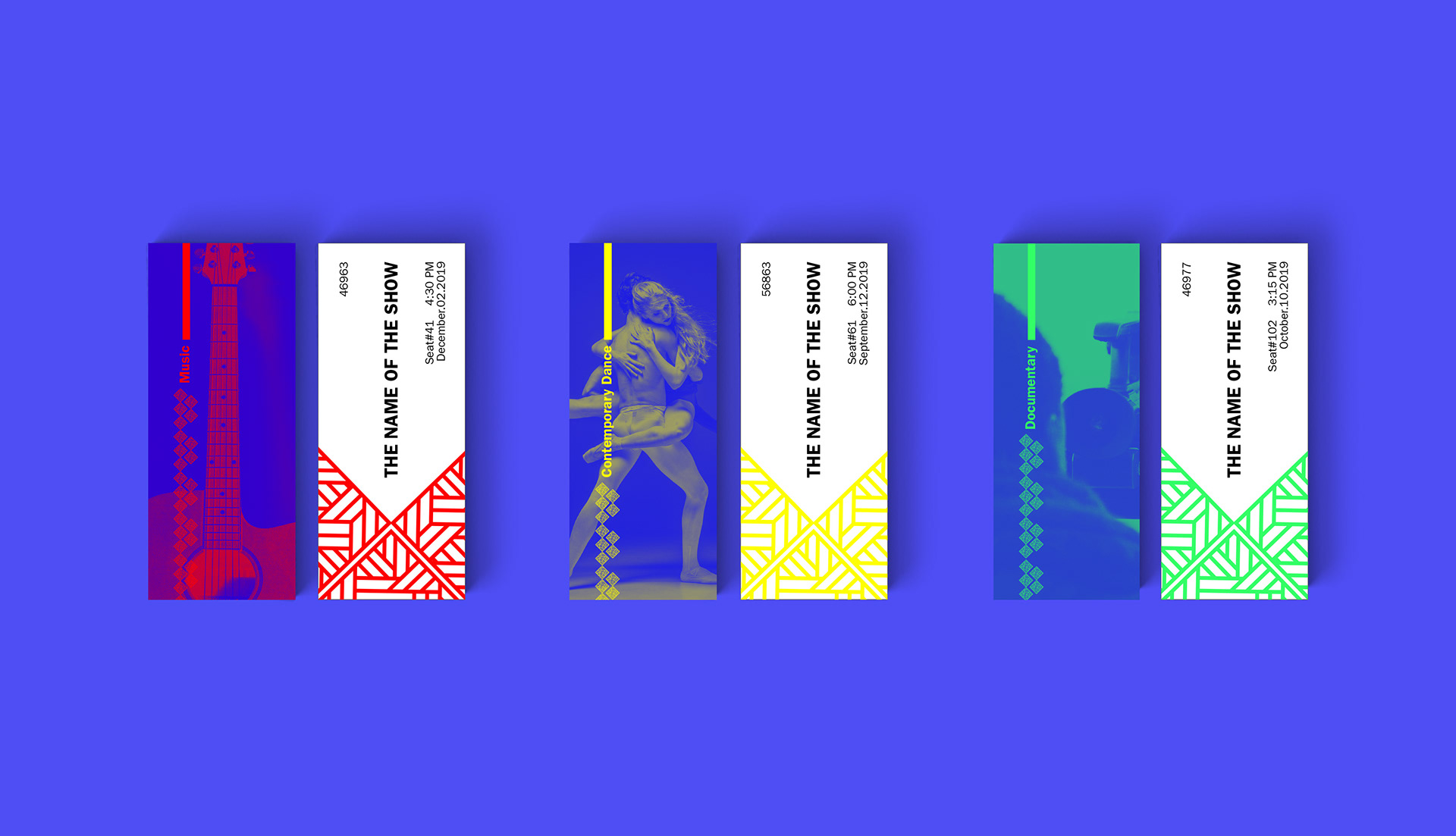
To differentiate the different departments across the Centre, we applied a colour-coding system, and assigned a specific colour to each department. We aimed to create continuity and consistency in the Customer Experience during their interaction with the brand.

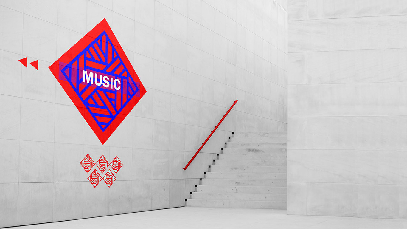
Passive colour-coding
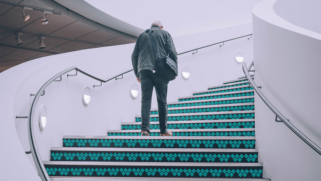
We then started working on integrating the design in the wayfinding. To insure integrating a seamless wayfaring system and user experience, we relied on our colour-coding system. We first designed patterns using our logo, then applied it across the Centre in a decorative way adding to the beauty of the interior while serving a passing wayfinidng system.
To improve our visitors experience, we used the designed patterns and the colour-coding system across our products. Starting with the tickets, as they will be the first indicator to the colour the visitor need to follow to get to their destination.
The second indicator the visitor will then has to follow would be the coloured path.
Active colour-coding
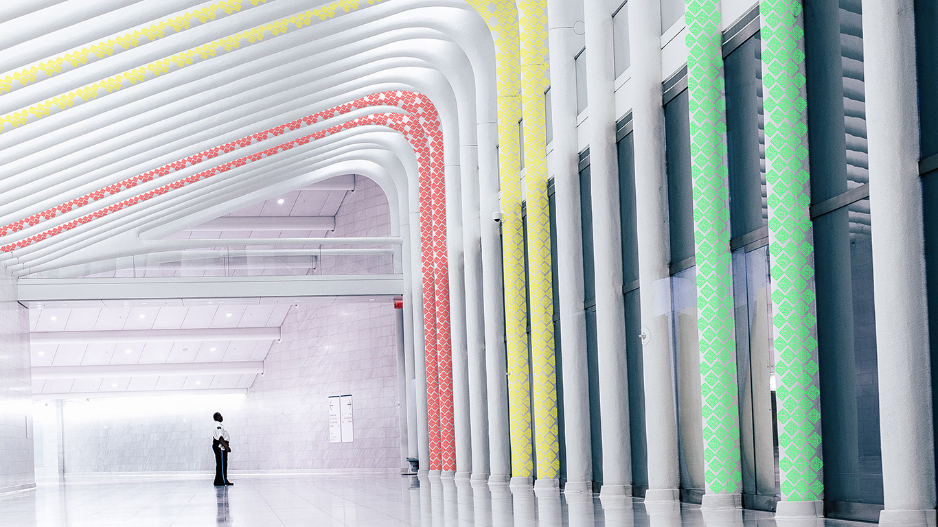
The use of the colour-coding system in wayfinding is applied in two different ways. In some areas, it is placed in a seamless and decorative way to guide you the visitors to their destination. In others, it is used in signage to measure the visitor they are on the right path still.
It is all about consistency
The colour-coding system was also applied to the internal use products.